Reading Heatmaps Without Fooling Yourself
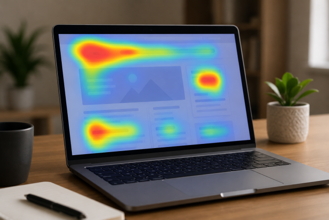
A heatmap shows where people clicked and scrolled. It does not show why, and it does not show what they wanted. Treated as a hypothesis generator it is one of the most useful tools available. Treated as evidence for a decision it will confidently mislead you, because the brightest spot on a page is often frustration rather than interest.


What each map can and cannot tell you
Click maps show attention and confusion together. Repeated clicks on a non-clickable element look identical to enthusiasm and mean the opposite.
Scroll maps show how far people got. Useful for placement decisions, and routinely misread. A steep drop-off at 40% is not automatically bad if the people who convert are all above that line.
Move maps track cursor position on desktop, which correlates loosely with reading. Loosely is doing a lot of work in that sentence. On mobile they do not exist at all, which matters when mobile carries around 78% of traffic.
The four ways teams get fooled
Aggregating everything. One map covering all traffic, all devices and both new and returning visitors averages away the thing you needed to see. Segment before you look.
Sampling too little. A map built on 200 sessions is a picture of 200 people. Colour intensity feels authoritative regardless of sample size, which is exactly the problem.
Confusing attention with intent. People look at large moving things. That tells you the element is visually dominant, not that it is persuasive.
Skipping the recordings. The map tells you where. Only the recording tells you what happened next, and what happened next is the whole story.
How to use them properly
|
Step |
What it does |
|
Segment first, by device and by converter against non-converter |
Turns an average into a comparison |
|
Compare the two segments |
The difference is the finding |
|
Watch 10 recordings around the anomaly |
Establishes what is actually happening |
|
Write a hypothesis with a mechanism |
“X causes Y because Z” |
|
Test it |
The map was never the evidence |
The converter against non-converter comparison is where almost every real insight comes from. A single map tells you what people do. Two maps side by side tell you what the people who buy do differently.
The measurable problems they miss entirely
Heatmaps will not tell you that shipping cost is killing your checkout. That shows up in a different dataset: Baymard’s research attributes 48% of abandonments to unexpected extra costs, 19% to mandatory account creation and 18% to a checkout that is too long.
They will not tell you the page is slow, either, though slowness is often what the confused clicking is actually about. Only around 42% of mobile sites pass all three Core Web Vitals, and a page that is not responding produces exactly the frantic click pattern people misread as engagement.
What it looks like when it works
At a personal care brand we work with, brand guidelines ruled out most of the layout changes we would normally consider. Heatmap data drove a navigation redesign instead, because the maps showed a specific pattern in how people were moving through categories that the analytics alone did not reveal.
The sequence matters more than the tool. The maps generated the hypothesis. The recordings confirmed the mechanism. The test proved it. Skip either of the last two steps and you are redesigning on the basis of colour.
When not to bother with them at all
If you already know which funnel step loses people and you already know the documented cause, the map adds nothing. Checkout abandonment driven by shipping cost needs neither a heatmap to diagnose nor a heatmap to fix.
They earn their place when the analytics say a page underperforms and nobody can say why. That is a common situation and it is the one the tool exists for. Reaching for them by default, on every page, every quarter, produces a lot of colourful screenshots and very few hypotheses.
A practical routine
Once a month, pull two segmented maps for your highest-traffic template: converters and non-converters, mobile only. Look only at the differences. Pick the single largest one, watch ten recordings of non-converters at that point, and write one hypothesis.
One hypothesis a month, properly grounded, will outperform a quarterly heatmap review that produces a slide deck and no tests.
The research and roadmap process we run is described at https://www.parahgroup.com
What's Your Reaction?